Finalized Sprites and Style
Hello everyone!
It's Daniel P. here to share with you the new assets, and discuss where the art will go from here!
To start let's discuss the fundamentals of the world itself, the ground tiles.
We opted to change the ground tiles for a few reasons, the colors were incredibly saturated making it a bit difficult on the eyes, as well all plant assets use the same color pallet leading to occasional bleeding between the grass and any plant life. The new pallet is slightly bluer and desaturated to help combat these issues. It also has less texture density, helping the buildings stand out on top of the ground rather than the other way around.
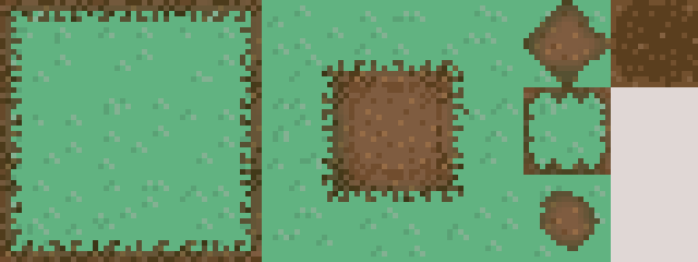
Since the ground received an update, other assets needed to be updated so that they could fit with the new ground. The tree, tractor, and house both received a shadow that matched the new color pallet so that they could blend into the environment while being grounded with a touch more depth.
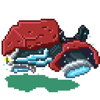
The tractor also had the angle of the chair shifted also to help with the perspective of it.
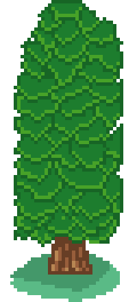
The tree got a transitional shadow to help emulate how shadows come through leaves.
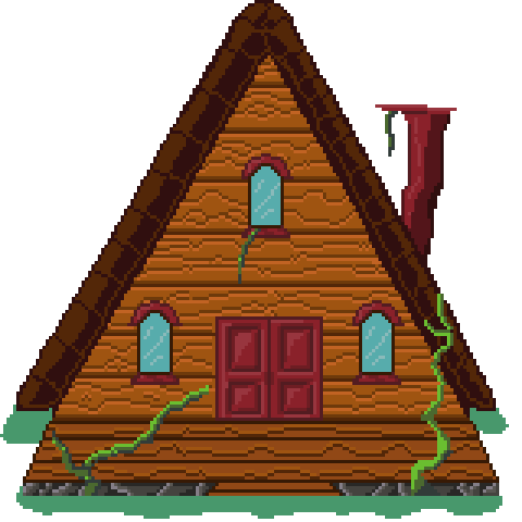
The cabin also got some more work to give it a similar perspective to the other buildings within the town. The ends of the roof also got rounded to help give it a more distinguishable shape.
Next I have the true final version of the walk animation! It is very fluid and upbeat which I am very proud of!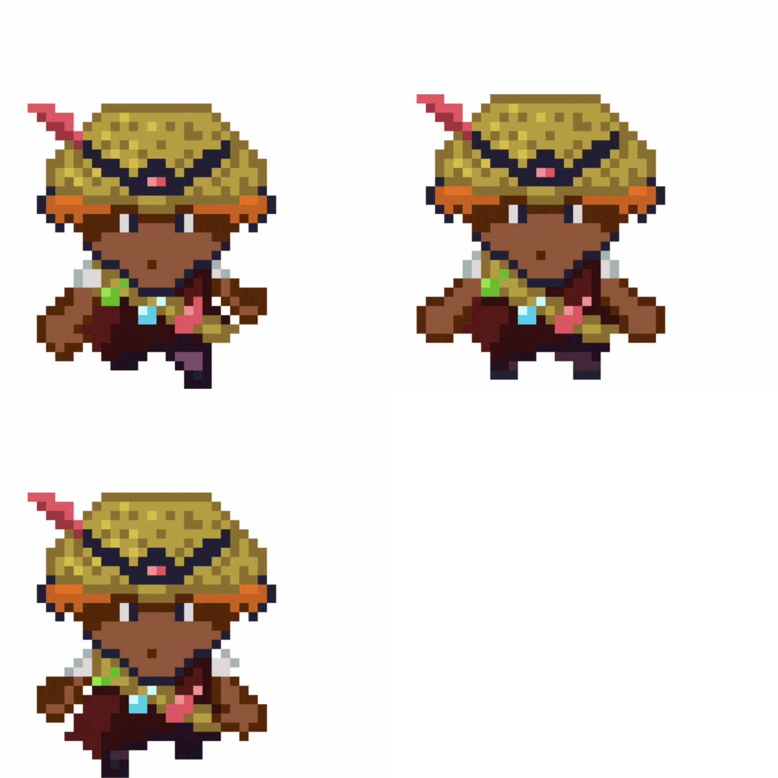
Walk Forward
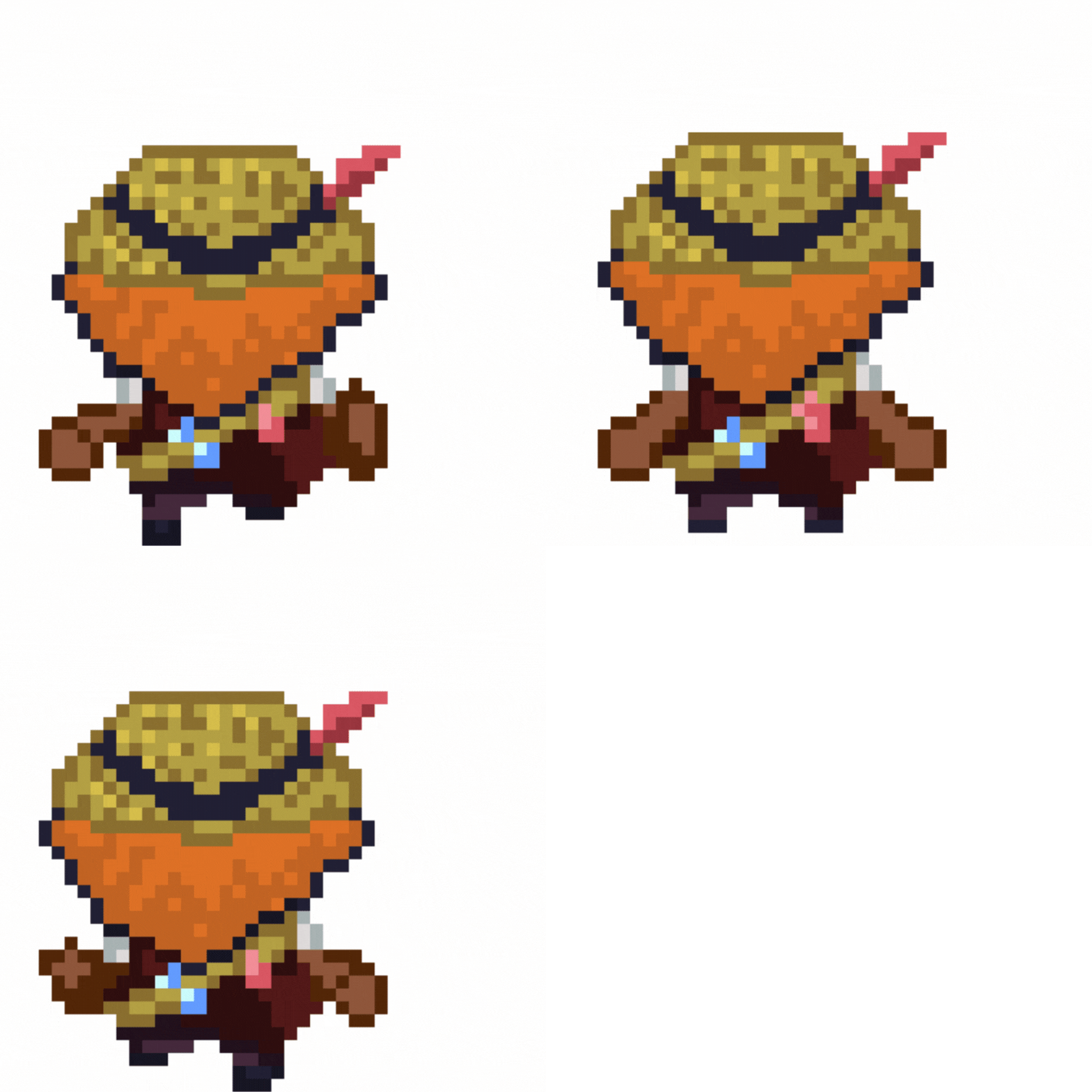
Walk Up
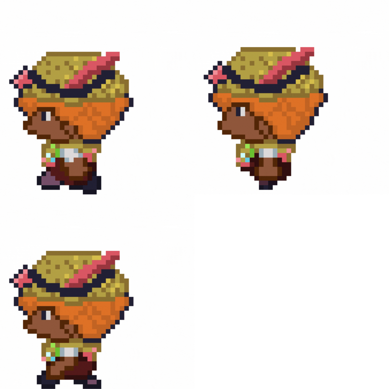
Walk Left.
The sidewalks were the hardest to get right, Initially each walk was only 2 distinct sprites but this made the side animation not convey motion very well. I instead shifted to a 3-frame animation with a frame between the 2, being idle of that direction helping amplify the amount of bounce the player has.
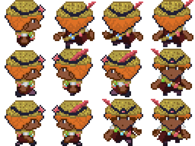
Here is the complete sheet for everyone to admire!
Next are more reworks of sprites. The strawberry has been an interesting sprite to work with as I both love it yet feel it's missing something. For these changes, I replaced the brown in the sprite with green. While a small change, this change came after multiple hours of trying to rework the tilled grass tile to prevent the browns from blending together when the player walked past them. In the end, even with changing the values, saturation, and base color of the tiled ground, nothing was quite as distinguishable as the shift to green.
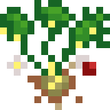
Here is the 3rd stage of the plant.
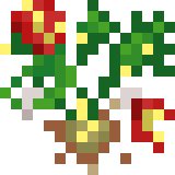
And here is the final stage.
At the end of the day, I'm glad I found something that works but a little sad I had to deviate from the realistic growth of a plant.
Speaking of a shift from the realism is the lemon!
The original assets of the lemon were too tall, leading to it occasionally obscuring plants behind it. To correct this I shortened the assets and changed them out. For the third stage, there is a little lemon hidden in a small brush, and the full-grown version is just a smaller version of the battle sprite. This option makes it more identifiable as a lemon as previously players mentioned not instantly recognizing the overworld sprite as a lemon.
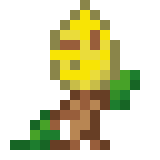
Final stage sprite

Stage 3.
Next, I have a UI element of the text box! For this, like most of my assets, it is inspired by Pokemon, with plants in each of the corners.

Finally, I have a fence, to help surround the plots of land and prevent players from running into the plants before talking to the NPC.
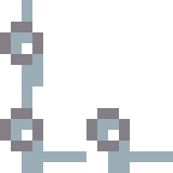
It is very simple just a classic white fence which I feel fits the vibes of the town.
This is everything updated. Now time to talk about the future.
I learned a lot about 2D asset creation in this process and now know what to refine. I want to add some sort of lighting to the assets to help give an additional sense of depth to the assets which help ground you in the environment, also all foreground assets should have high texture density while background assets should only have just enough detail to be distinguishable but not enough to draw all of your attention or be disorienting due to how often they are going to be used. As for the NPC's they will follow the template of the player's sprite sheet for the movement as it has a good amount of bounce in each frame. Finally the enemies will be primarily based on how they grow for their 3rd and 4th stage, but their 4th stage will have a focus on clarity rather that realism due to realism causing increased confusion.
I hope you guys have enjoyed this art! I can't wait for you all to see it in action! stay tuned for more updates from myself and my other teammates!
Get Harvest Quest Demo
Harvest Quest Demo
Farming Sim JRPG where you have to fight your crops to harvest them
| Status | In development |
| Authors | Daniel Reber, pumpkined, Aykou, ida, silentwolf83, Imani Mobley |
| Genre | Role Playing |
| Tags | Farming Simulator, JRPG, Turn-Based Combat |
More posts
- Updated Level LayoutFeb 28, 2025
- ida update -- new map, new buildsFeb 27, 2025
- Battle System - 02/26/2025Feb 26, 2025
- Battle System Update - 12/02/2024Dec 04, 2024
- Designer Update!Dec 04, 2024
- ida's second updateDec 02, 2024
- ida's first updateNov 06, 2024
- SpritesNov 06, 2024
- Battle System Update - 11/05/2024Nov 05, 2024
Leave a comment
Log in with itch.io to leave a comment.